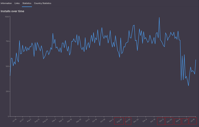
On Flathub Pinta’s page scroll down to the bottom and click on Statistics and the following is displayed:
All the data are displayed for current year, but see the x-axis, it does not make sense. At the end there is Dec 19, then Dec 9??? then Nov 20??? Jul 3??? and Jul 16??? I have marked with red rectangle the wrong data in x-axis.
It looks like graph is broken. I just checked the graph because new version of Pinta was released few days ago and naturally would mean increase of downloads, not drastic fall.
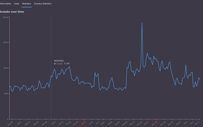
EDIT: Now I see graphs for all flatpaks are broken. Check for e.g. Firefox

